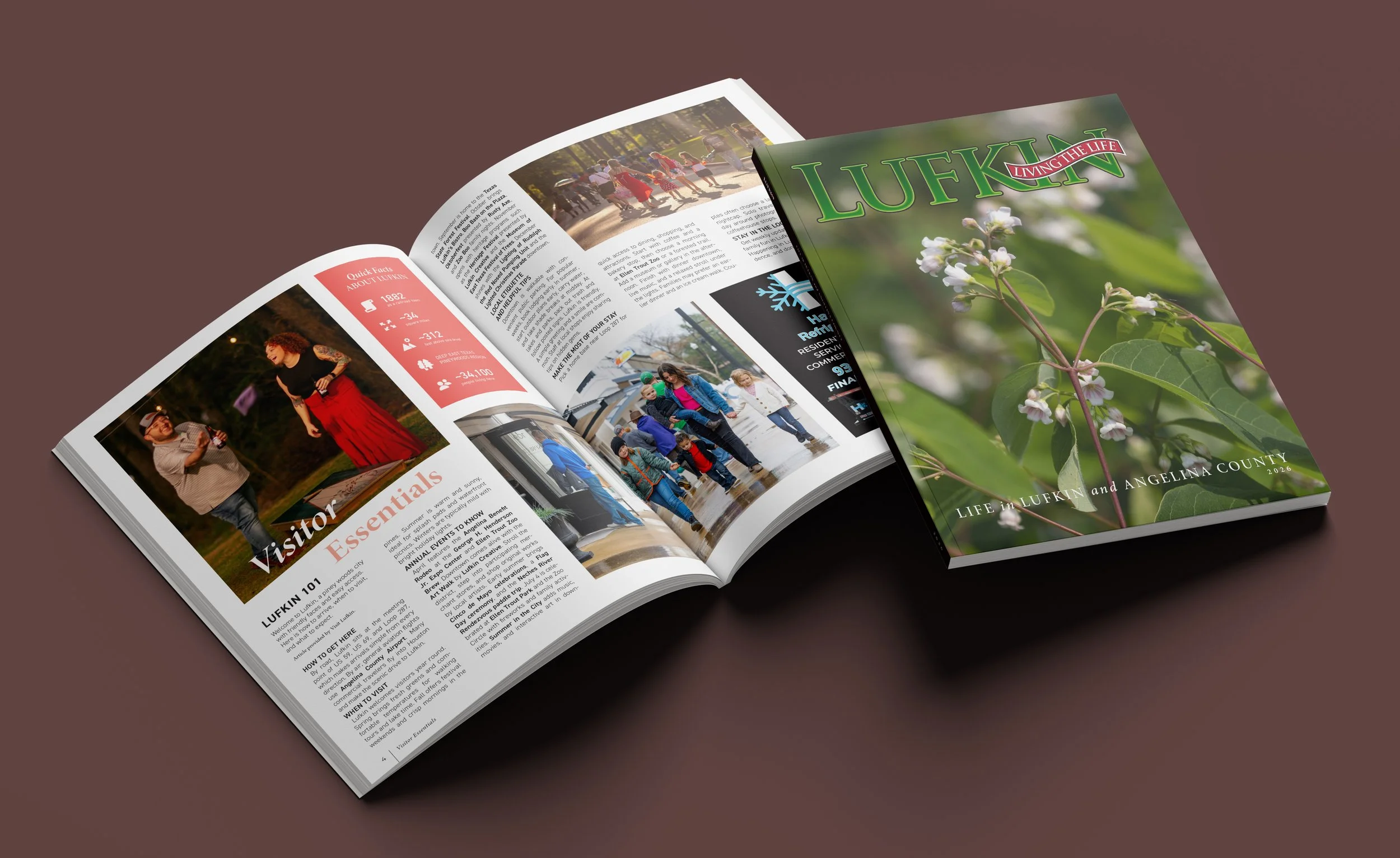
Lufkin Living the Life magazine
2023-Present
Lead designer for the 2025 and 2026 editions
Advertising assistance for the 2024 edition
❋
Establishing brand guidelines for a local lifestyle magazine
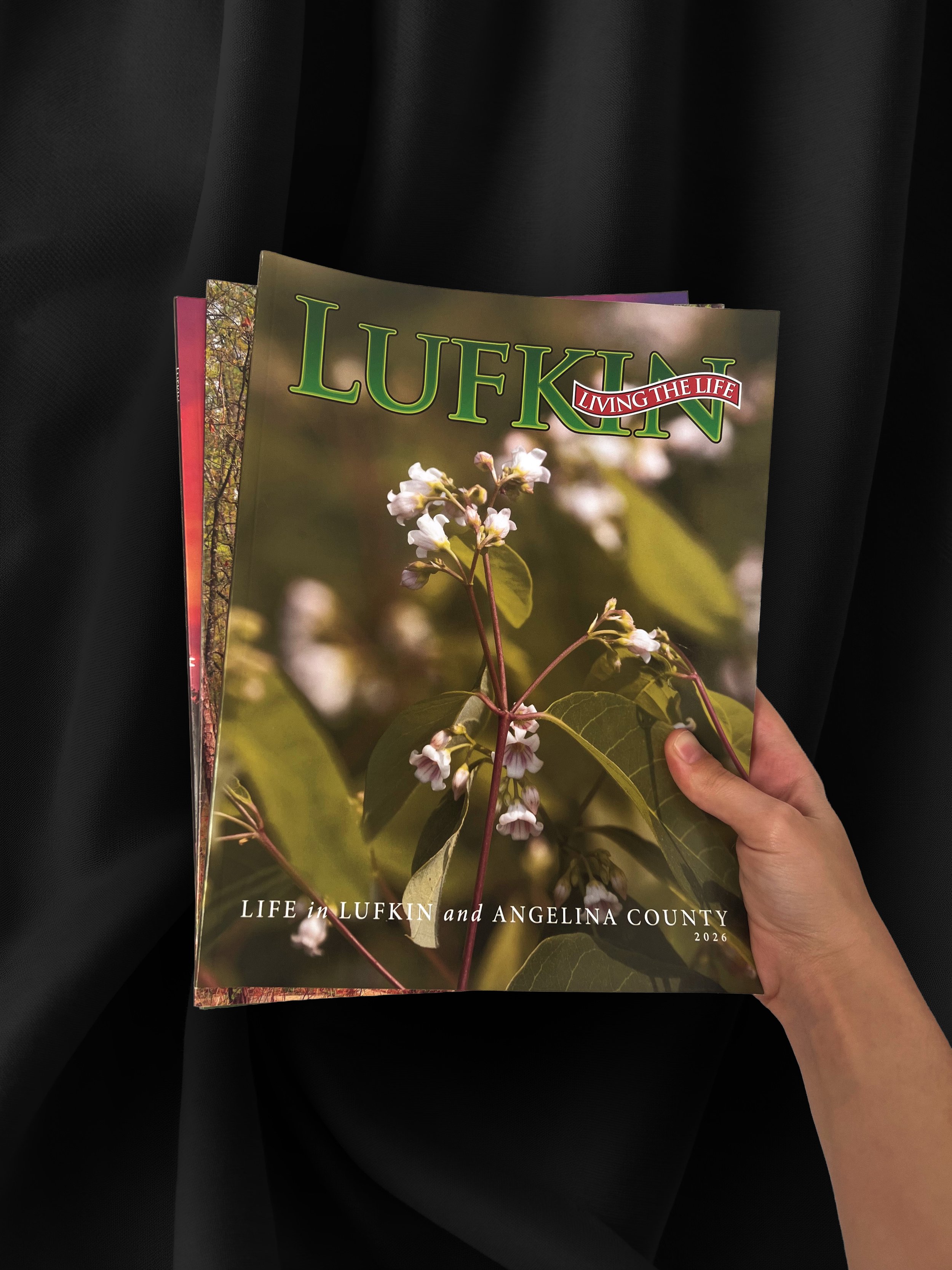
Some context
For those who aren’t familiar, Lufkin is a small city in the Pineywoods region of Deep East Texas. This suburban city is home to growing families and retirement communities, with many residents sharing a love of the arts and a search for their next adventure. Over the years, Lufkin Living the Life magazine has become a one-stop shop for all things Lufkin. As a partnership between local publisher Kevin Smithhart and the Visit Lufkin team, the magazine aims to highlight what the city has to offer and serve as a year-long guide for visitors and locals alike.
Establishing goals
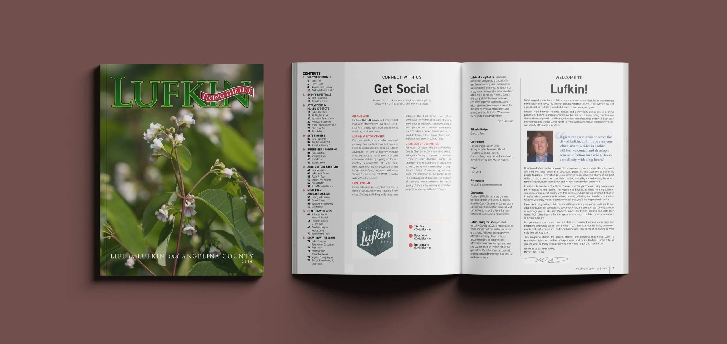
The Lufkin Living the Life logo and cover style has been in place since the magazine published its first edition. Though over the years, the style within has varied. Some years followed its own stylistic guide while others varied from page to page. Naturally, when I was asked to design for the magazine, I was also given a lot of creative freedom. I remember lighting up when being told I was basically free to do what I wanted stylistically. I was only asked to follow a couple of guidelines: maintaining the style and layout of the previous year’s opening spread, updating information as needed, and including gutter bleed photos as often as possible.
With the publisher’s requests in mind, I gave myself the additional goal to create a style that sticks into the future. One that ties the brand and the city together and streamlines the design process to save more time to create content that inspires and excites readers to Visit Lufkin.
Stylistic analysis
As a very analytical designer, when working with a new brand, I always take the time to explore what has been published by and about them in the past. In the case of this magazine, before beginning work on the 2025 edition, I analyzed past publications to identify patterns (or lack thereof) in:
Typographic style
Color palette
Photographic style
Content organization
With the goal of internal rebranding in mind, after identifying the design choices made in the past, I analyzed what I thought worked, didn’t work, and why. I did this once with all the past editions prior to designing the 2025 magazine, and I did it again to review my own work before beginning the 2026 magazine.
Of course, almost a year had passed since my last analysis, and in that time, I had done a lot of growing as a designer. At the time, I was working full-time at Lufkin Printing Company, spending 8 hours each day designing a wide variety of projects (mainly for print) and learning a lot about Lufkin along the way. So, when I revisited the 2025 edition, I found myself unhappy with the style. In this edition, I had used color-coding and blocking to organize the magazine. This in combination with the heavy use of the sans-serif font family, DIN 2014, left the magazine with a playful, almost childish, vibe. We had all enjoyed the look of it but agreed that this style was not a strong reflection of the city of Lufkin.
Pulling from my own experience commuting and working with the city, I had seen just how much industry strengthens Lufkin’s place in Deep East Texas. Even when narrowing my view to just the magazine, I considered the role advertisers had in the publication. The magazine’s backbone is its advertisers, with many also providing articles to be included in the table of contents. To drive my point home, I performed market research, focusing on the demographics of the city. In this research, I found that Lufkin’s median age is about 35 years old, with over a quarter of the population being over 50 years old (according to the 2024 census report). With all this in mind, I realized that the magazine should have a more mature and professional tone to it, minimizing fluff and maximizing impact. I carried this goal with me as I created guidelines to follow in the 2026 edition.
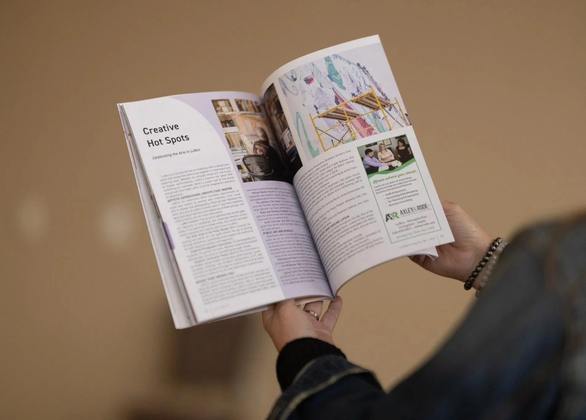
Photo Credit: Visit Lufkin / Facebook
Strengthening branding with strategic creative choices
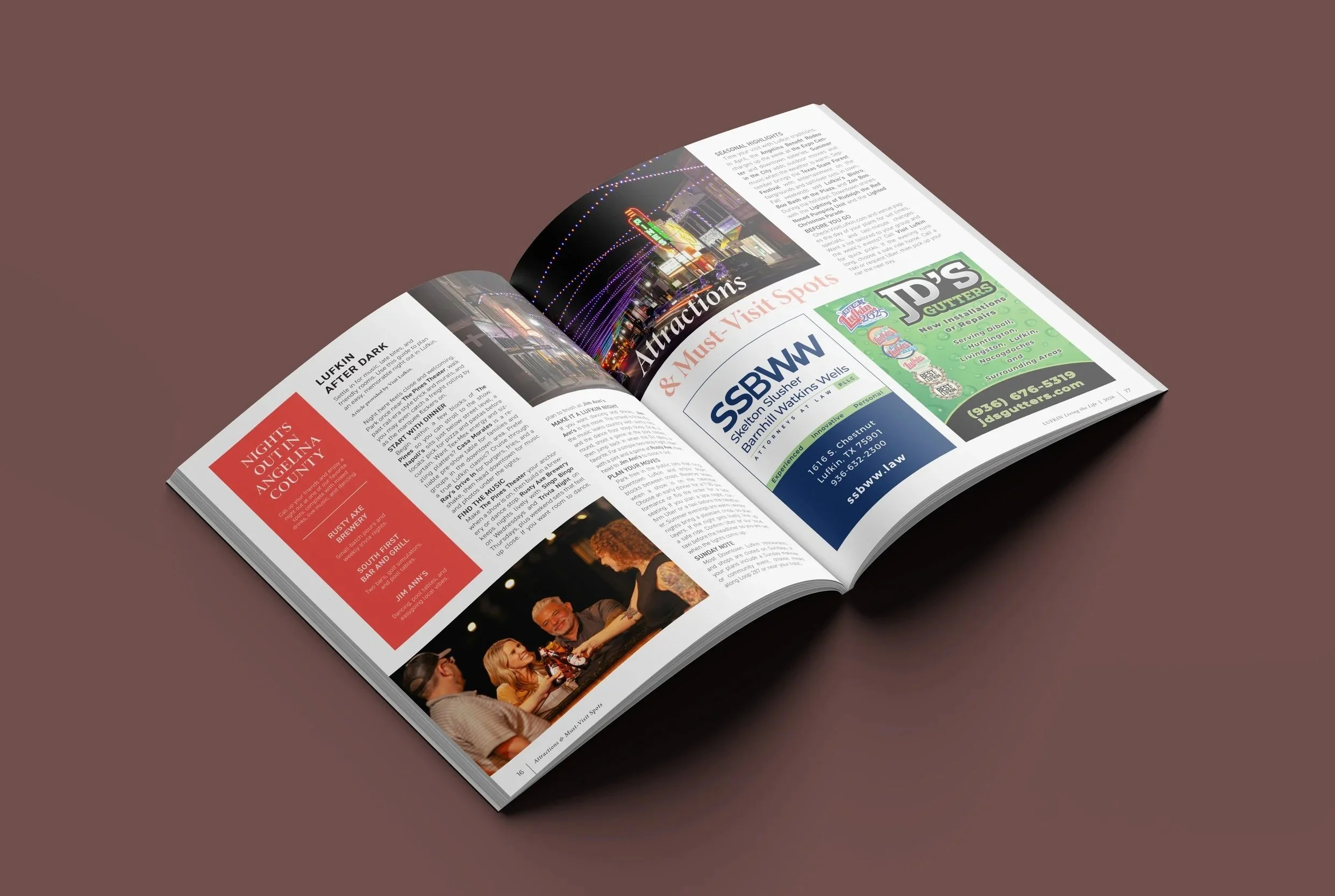
Based on my findings, I made the following changes as I began work on the 2026 edition:
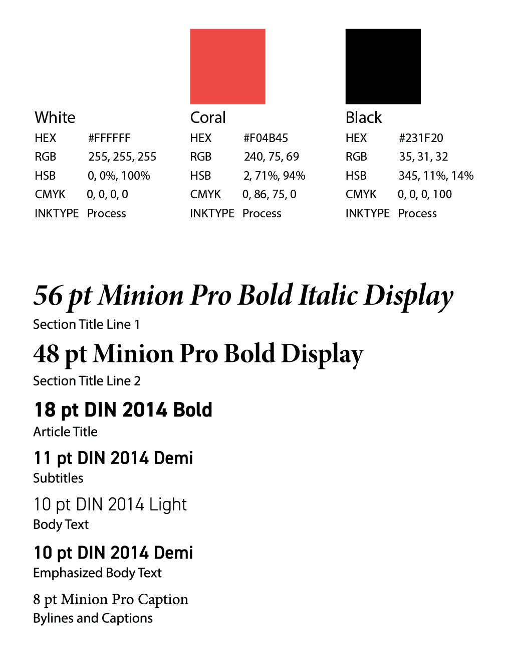
Minimizing the color palette to a three-color system. I focused on letting the pops of color come from carefully chosen images and related graphics rather than from the previously used color-coding and blocking.
Reworking section dividers to use fewer pages and avoid unnecessary content.
Expanding the presence of the serif font family, Minion Pro, to connect the interior and exterior of the magazine and better reflect local demographics.
Once I solidified the changes I wanted to make, I brought a sample spread to Mr. Smithhart to review the changes and see what he thought. I walked him through the logic behind my changes, and much to my excitement, he loved it. In the end, the side goal I made for myself became an official request from the publisher, and this style guide will be used as a reference for future editions of the magazine.
-
A lack of cohesion left the brand feeling disconnected from itself. Style rebranding was needed to connect the outside and inside of the magazine with both the established brand and the local community.
-
Bringing this brand together required analyzing what was published to find where cohesion was already established. I applied these findings as the following stylistic changes:
Making a commonly appearing color a core piece of the color palette.
Dividing sections in a way that saves space and reflects the professionalism of the city.
Refining typographic choices into a cohesive style guide to be used throughout the magazine.
Other services provided
As it happens with many design roles, this was in no way the only role I had in the creation of this magazine. In addition to creating a style guide for the brand, I have also been in charge of the content ideation and organization, advertising design and client communications (for some advertisers), the layout design, photography selection, and proofreading each year.
Additionally, I had the honor of writing a few of the articles included in the magazine over the years. If you’re curious, you can click this link to read these articles for yourself.
Reflecting on my work
My work with this tight-knit team was my first editorial design contribution to a published magazine and has become one of my favorite design projects to date. The project brought me back to my yearbook design roots, connected me with the local community, and grew with me as my design skills and eye for making strategic creative decisions strengthened. Looking back now, it is amazing to see the growth that has happened both in myself and the magazine over time.
“The quality, the layout, everything came together beautifully. It truly reflects our community in such a polished and meaningful way.”
— Karina Sotelo, Visit Lufkin